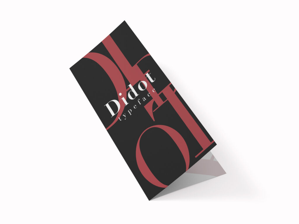
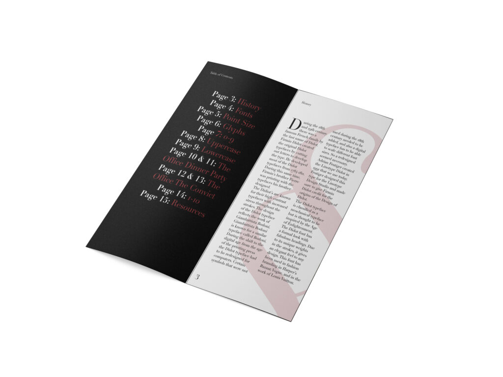
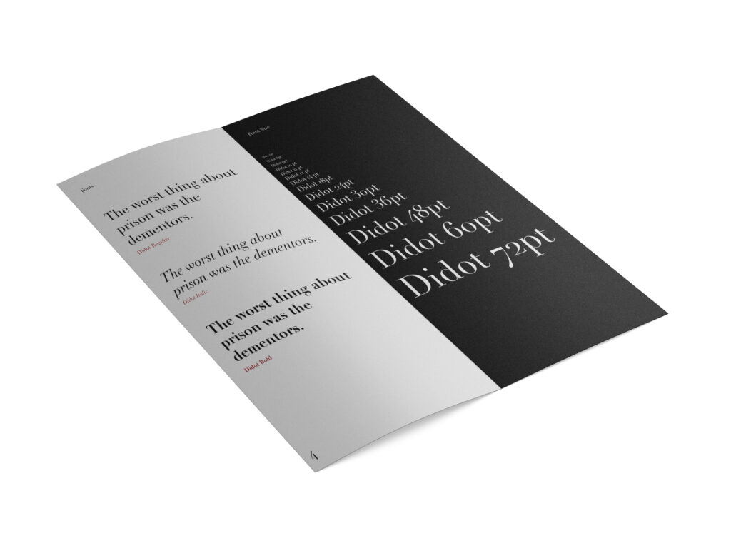
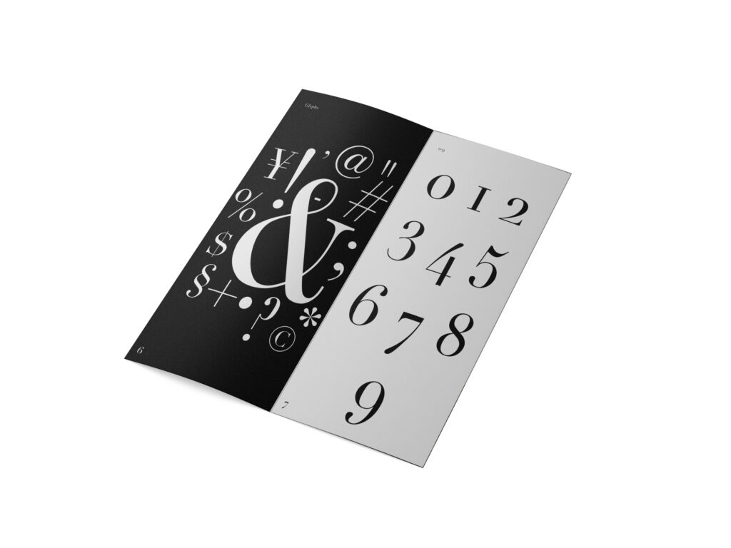
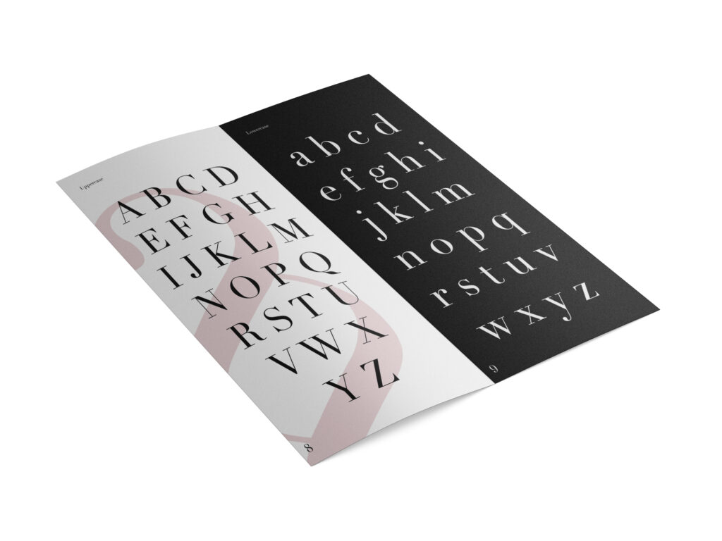
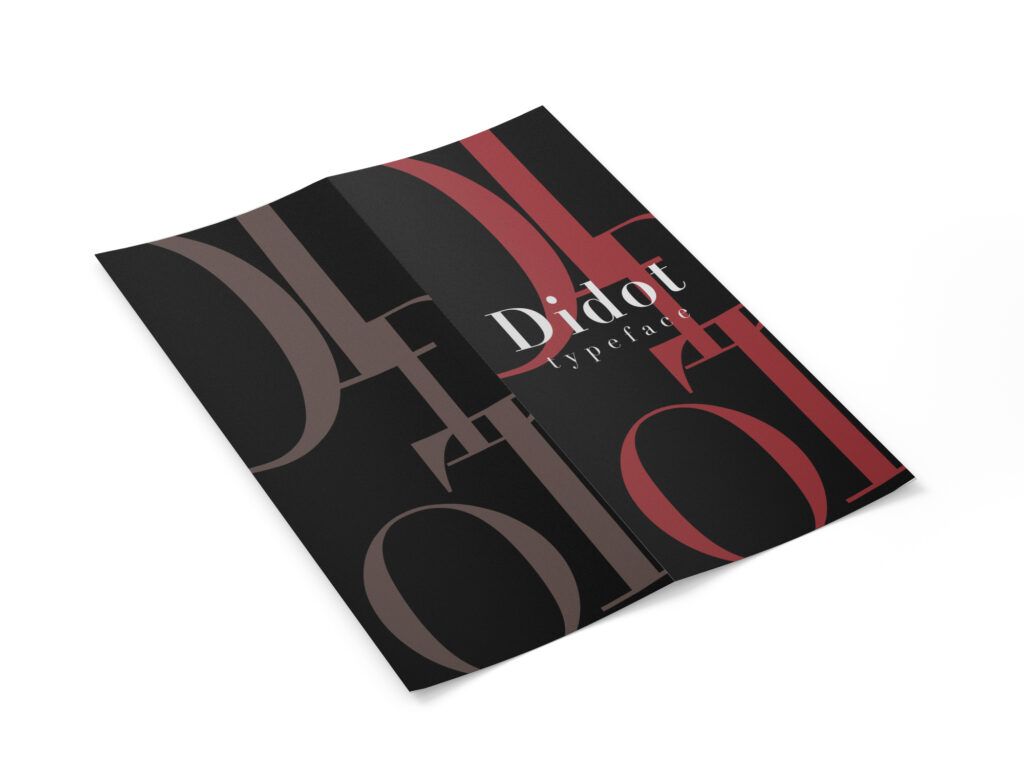
I designed this type specimen book for my Typography class. We each had to pick a font and I chose Didot because I was fascinated with its serifs.
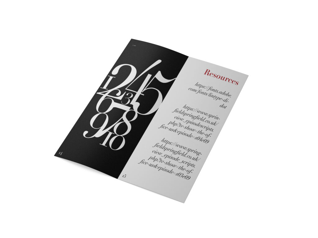
I designed this type specimen book for my Typography class. We each had to pick a font and I chose Didot because I was fascinated with its serifs.